The development of a distinct brand identity for GUINNESS beer is closely linked with the history of the brand's packaging and advertising. Until the 20th century GUINNESS was supplied in bulk to bottling firms and publicans, who transferred it from wooden casks to bottles. When bottling GUINNESS, each bottler or publican used their own label on the bottles, and so a range of label designs and names appeared on bottles of GUINNESS.
As the overseas trade grew throughout the 19th century, the Company introduced its own trademark bottle label, to help protect its stout brand overseas. This label, introduced in 1862, was the now famous, buff–coloured oval label. This was the first step taken towards establishing a brand identity for GUINNESS. The Company printed and supplied this trademark label to its bottlers, who had to guarantee that they would sell ‘no other brown stout in bottle’. This was an early form of quality control as it ensured the publican would not ‘mix’ various stouts together and call the product ‘GUINNESS’.
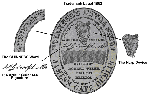
The main features of the trademark label were the ‘Guinness’ name, harp device and Arthur Guinness signature. These features were to evolve into the three core elements of the GUINNESS brand identity.
In the 20th century, when official advertising began and new product variants such as GUINNESS Draught were introduced, and the brand identity developed further. The product was now advertised in various media, and in a range of different styles. Measures were taken to strengthen the brand image through standardising its design. A typeface was developed for the ‘Guinness’ name, now used on its own in posters, television commercials and merchandise, as well as on bottle labels. And a distinctive brand identity began to emerge, with the three main features of the trademark label, appearing as the core elements.
The brand identity was then used to promote GUINNESS, on all forms of packaging, and in all forms of promotional material. The core elements of the brand identity are still in use today, and have been adapted to suit different packaging forms and markets. Subtle changes have also been made to their design over the years, as the brand identity continues to evolve with the brand and product. The most recent changes were made in a redesign of the brand identity in 2005.
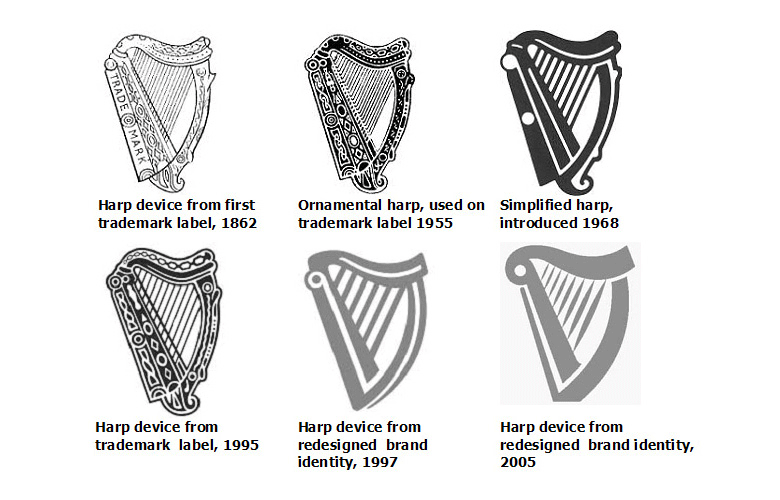
The harp device is based on a famous 14th century Irish harp known as the “O’Neill”, or “Brian Boru” harp, which is now preserved in the Library of Trinity College Dublin. The harp device was registered as a Guinness company trademark in 1876.
A number of changes have been made to the design of the harp device since its introduction, including a reduction in the number of strings shown. In 1968 a simplified version of the harp was introduced, and in 1997 and again in 2005 it was streamlined even further when the brand identity was redesigned. Initially the harp appeared in black, but with the introduction of the simplified harp, began to appear in gold as well.
The harp is also the official national emblem of the Republic of Ireland and can be found on the Republic’s coinage. The difference between the Guinness harp and the Republic’s harp lies in the position of the harp’s straight edge (sound board). The straight edge on the Guinness harp always appears on the left, whilst the straight edge on the Republic’s harp, appears to the right.
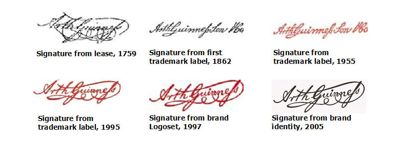
Arthur Guinness’ now famous signature appeared in the centre of the first trademark label issued in 1862. That signature was based on the signature that Arthur Guinness made, on the lease for the St. James’s Gate Brewery, in 1759.
Like the harp device, the signature has been gradually remodelled, becoming a more accurate representation of the original signature on the lease. The colour of the signature has also changed. It first appeared in black on the trademark label in 1862, but was changed to red in 1953 in conjunction with a redesign of the trademark label.
In the most recent redesign of the brand identity, the signature appears in black on a vignetted background as a secondary graphic for product packaging.
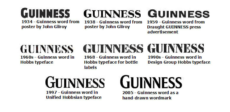
The Guinness word was a core feature of the original trademark label. It was not only the product name, but also the name of the family that ran the business. The Guinness name was not only used on bottle labels, but was also used extensively by the Company at the St. James’s Gate Brewery — on wooden casks, horse–drawn drays, barges, ships, and even on the Brewery’s gates. With the advent of official advertising in 1929, the Guinness name was used on posters, press advertisements, and merchandise. Appearing, all the while, in a variety of lettering styles.
This inconsistency in style was removed in the 1960s when the first official typeface for the Guinness word was introduced. This new typeface was developed by Bruce Hobbs, an artist at the advertising agency that held the account for GUINNESS — S.H. Benson Limited. The ‘Hobbs’ typeface, as it became known, was launched in 1963, and was initially used on posters only. It appeared in red lettering on a cream background. In 1968 the Hobbs typeface was slightly altered, to a smoother line, and was used for the first time on bottle labels. From then on it was used on all other forms of brand communication.
Further modifications were made in the 1991 and the typeface became known as ‘Design Group Hobbs’. It now appeared as gold lettering on a black ground. Then when the brand identity was redesigned in 1997, a new typeface called ‘Unified Hobbsian’, was introduced. The typeface appeared in white lettering on a black ground, the letters were unified except for a break in the two middle ‘N’s, and the ‘G’ was raised slightly above the other letters. The word was redrawn as a wordmark for the new identity in 2005, and no longer exists as a font.
If you have any further questions about the history of Guinness please contact them at:
Guinness Archive, GUINNESS® STOREHOUSE, St. James’s Gate, Dublin 8
Telephone: +353 1 471 4557
Email: guinness.archives@diageo.com
Opening Hours: Mon - Fri 09:30 to 17:00
The GUINNESS and GUINNESS STOREHOUSE words and associated logos are trade marks